

Punctuate: a multi-hyphenate marketer’s new brand identity
An executive coach and marketing consultant in need of a cohesive brand identity that serves two distinct audiences.
SCOPE OF WORK
Logo and brand identity.
The Challenge
Punctuate Solutions needed a brand identity that could effectively represent the work they do with two distinct client bases: executives seeking one-on-one coaching and companies requiring senior-level marketing leadership and support.
The challenge was to create a unified visual system that could cater to these two diverse client segments while conveying the thoughtful, holistic approach of the company’s founder.
“Erin is a unicorn, a rainbow, and a magician rolled into one. She expertly translated the vision for my business into a cohesive, beautiful design that expressed just the right tone and message.”
Dorothy Davis, Owner, Punctuate Solutions
The Strategy
The approach was to create a cohesive visual system around the company name "Punctuate." This involved incorporating playful punctuation marks overlaid by captivating images of nature and natural settings.
To distinguish the two areas of the company's offerings, a distinct visual approach was adopted for each.
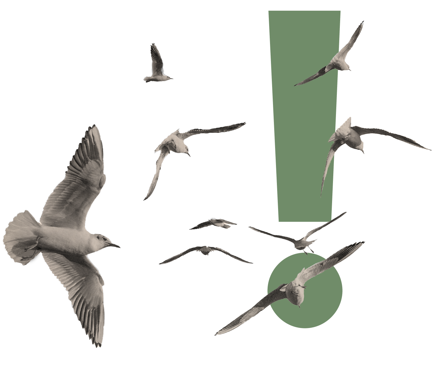
For consulting, images of nature showcased an orderly approach to streamlining groups of things, such as schools of fish, flocks of seagulls, and a dandelion blown in the wind.
On the other hand, the coaching segment featured a single person looking into a "window" to a natural setting, symbolizing an aspirational next space they can occupy by advancing their career.

Results
The brand identity successfully captured the essence of Punctuate’s work with both executives and companies, effectively unifying the two distinct client segments under the Punctuate brand.
Drawing from old-school editing marks, the Punctuate wordmark also incorporates a nod to the pilcrow (¶), a glyph used to identify a paragraph. The copy throughout Punctuate’s website references editorial language as well.
The approach also created a sort of “branding building blocks” that could be mixed and repurposed for additional imagery as needed.
A library of punctuation marks and nature images was created, alongside guidelines for creating appropriate branded graphics.
An expanded color palette - along with accessibility-tested pairings - means images can be refreshed as needed.
Document layouts incorporate the brand elements seamlessly.

Website

Brand Guidelines
“Erin is a dream collaborator: thoughtful, patient, insightful, and just a joy to be around. I was fortunate to have Erin as my guide and partner for this project!”
Dorothy Davis, Owner, Punctuate Solutions