B2B SaaS Wellness Software Branding


Wellsource is a company with a well-established history in the health and wellness industry. After 40+ years of defining the wellness space, the brand needed an updated and more modern direction.
SCOPE OF WORK
Logo and brand identity, graphic design, website design, copywriting, competitive analysis, messaging and product differentiation
The Challenge
The company had capitalized off a well-established brand and recognition as leaders in the category for more than 40 years, but the visual look and feel hadn’t stayed current, and didn’t effectively represent the innovation of the technology platform. The solution had to be scalable and highly templatized, as any modernization efforts for a brand refresh would be deployed across 30+ web pages, 50+ landing pages, 40+ pieces of marketing collateral.


Example of previous branding elements
The Solution
The next iteration on the company’s brand needed to continue the legacy of the last 40+ years, but signal the innovation and technology the new product represented. In addition to creating a solution that was easy to generate and scale, there were 3 main guiding principals:

Website before and after rebrand
-

Keep it Human-Centered
Continue to represent people of all walks of life, engaging in healthy everyday behaviors.
-

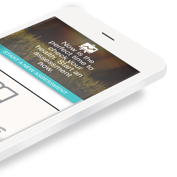
Incorporate more visual cues of the products and technology
Showcase the product in more modern, simplified device mockups.
-

Represent the value of data
What should we know about the services you provide? Better descriptions result in more sales.
“The Swooshies”
The colorful branded band of lines, dubbed “swooshies” by the team, represents the prevalence of health data, and the capability of the product to reveal what is otherwise hidden about a person’s health and lifestyle. It is layered, complex, and beautiful.
Incorporating “swooshies” into imagery was also an effective way to add branded visual interest to otherwise stock photography.


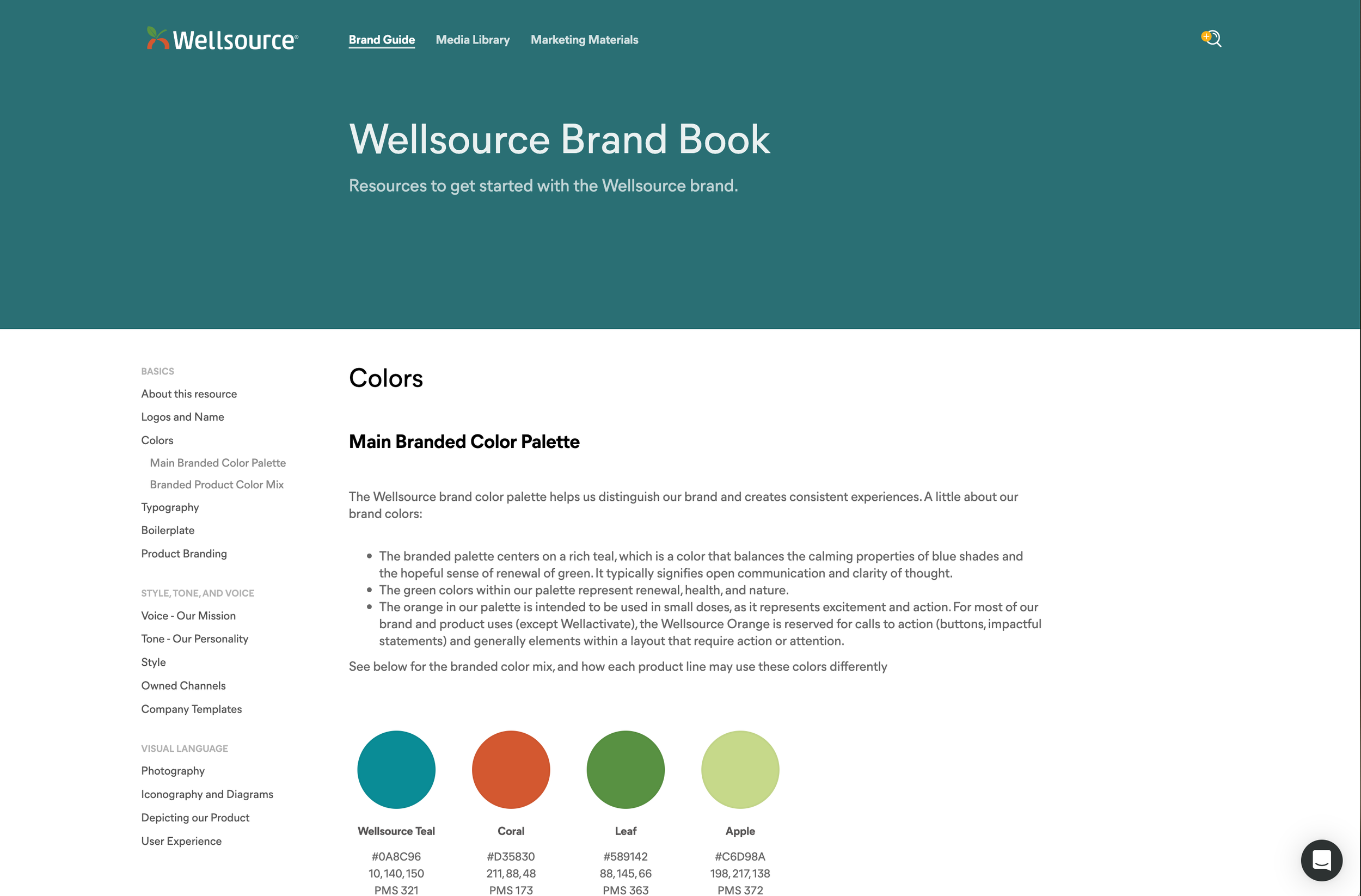
A Documented Content Strategy and Brand Guide
More than building a brand identity, this project meant building a design system that could be flexible but consistent across multiple stakeholder departments. The brand guidelines developed included everything from tone and style, to channel best practices and how to represent screenshots of the product.
The brand guidelines and marketing materials library became a significant resource across the company, putting the ability to build branded, consistent documents into the hands of developers, client success, sales, and the executive team.